Doncaster Junior Football Club
The Doncaster Junior Football Club was formed in 1968 and was a founding member of the (then) Doncaster Districts Junior Football League. The club has provided development and recreational opportunities to thousands of children over that time, some of whom have gone on to become well known AFL stars.
Doncaster Junior Football Club is proud of their family-friendly culture and the community spirit around their club. Their focus is much more on learning, playing, growing, participating, and having fun as part of a team, than it is on competing to win.
The club is well aware of the need to continue to grow and develop and it is with this long term strategy in place that the club is proud to announce the release of their very first, fully club branded, native mobile phone app for the iPhone!
The app is the number one tool for all you players, supporters, members and sponsors to have in order to make sure you are always kept up to date with absolutely anything to do with the footy club.
The information tabs available to you in the app will cover everything and anything to do with the football club.
Some of the information tabs available to you in the app are as follows:
- Latest News
- Teams
- Fixtures
- Results
- Player Profiles
- Grounds
- Merchandise
- Videos
- Images
- Events and much much more!
If you love the footy club, the simple fact of the matter is that you need this app!
Download this app and stay in touch with the mighty Cats!
Go Cats!
Its update time again folks and boy oh boy do we have a few updates for you!
Are you strapped in because these ones are long, strong and downright mind boggling!
Here we go!
1) First of all we removed an image from the navigation bar at the top and used colour instead. In simple terms, the app will look a whole lot nicer than before. Comprendo?
2) We then decided to remove an image from the tab at the bottom and used colour. What does this mean? Basically the app is easier on the your eyes!
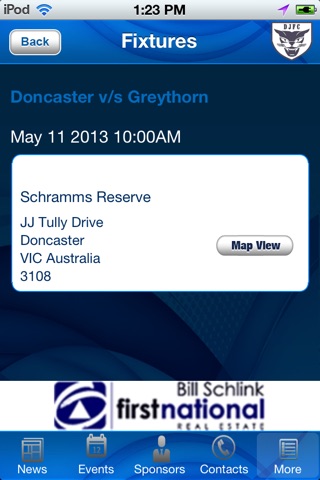
3) We also have included a new in app map which draws the route and also introduced a fancy new button to change the view of the map.
4) Once we were at it, we decided to introduce a new interface in the app for the back button without using any image.
5) We also thought it would be a good time to change the user interface on the login page to make it a bit more snazzy and enjoyable to use.
6) We also added a new setting user interface for the functionality of editing information about the user and their logn.
7) In addition to the above we also added in an alert on calling function that confirms the users actions
8) Whilst we were doing the above we added an activity indicator for zooming the images on the news tab
9) We also lined things up a bit better by centrally aligning the contents on the results page.
10) We jazzed up the Contact Us page and it will only be shown when the data is available.
11) We also took our sponsors logo screen to the next level by ensuring the background loads first and it now avoids a white screen until the club logo and sponsor logos are loaded.
We told you it would be a mouthful and rather long winded but we have no doubt you will love our new features and updates!
Enjoy your new and improved app!


